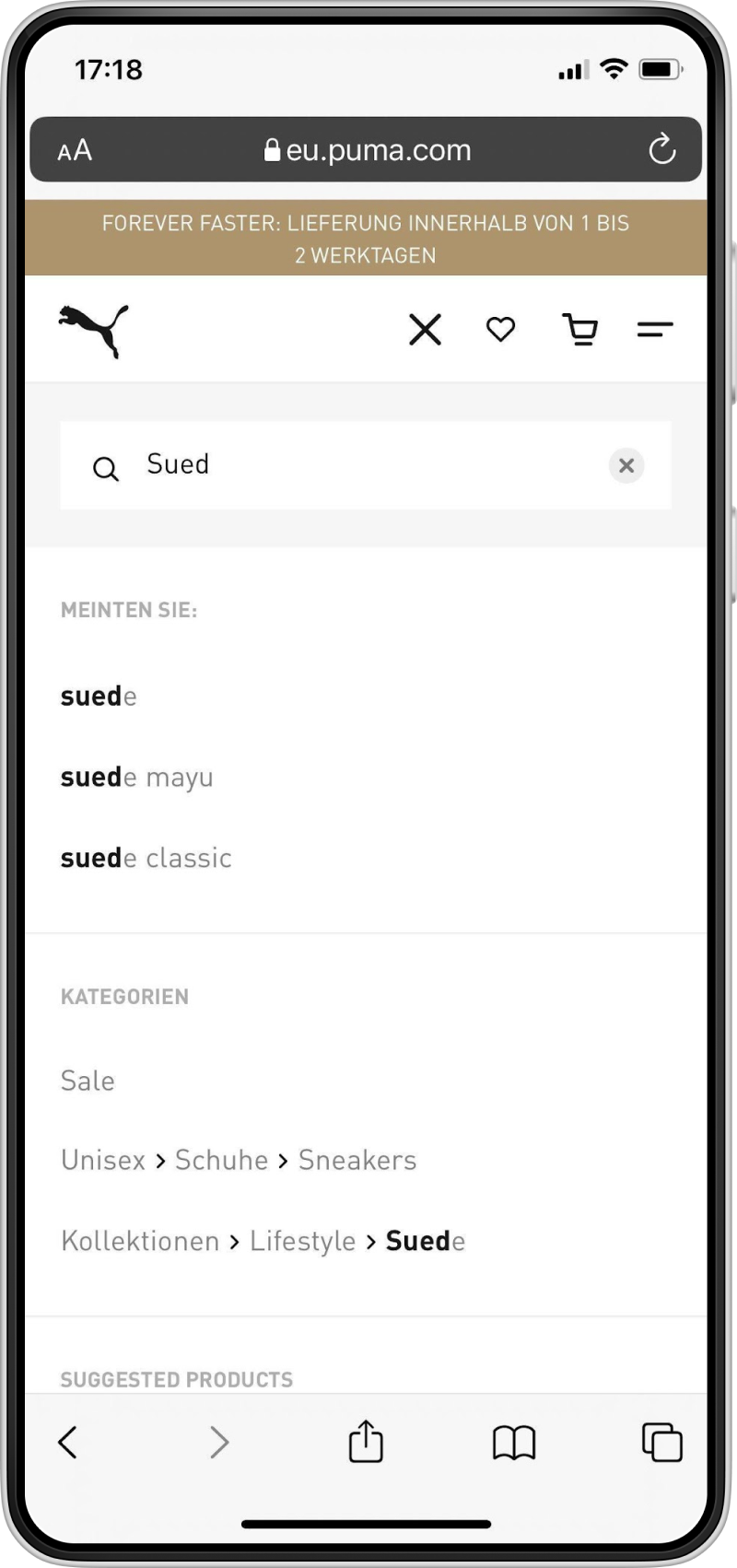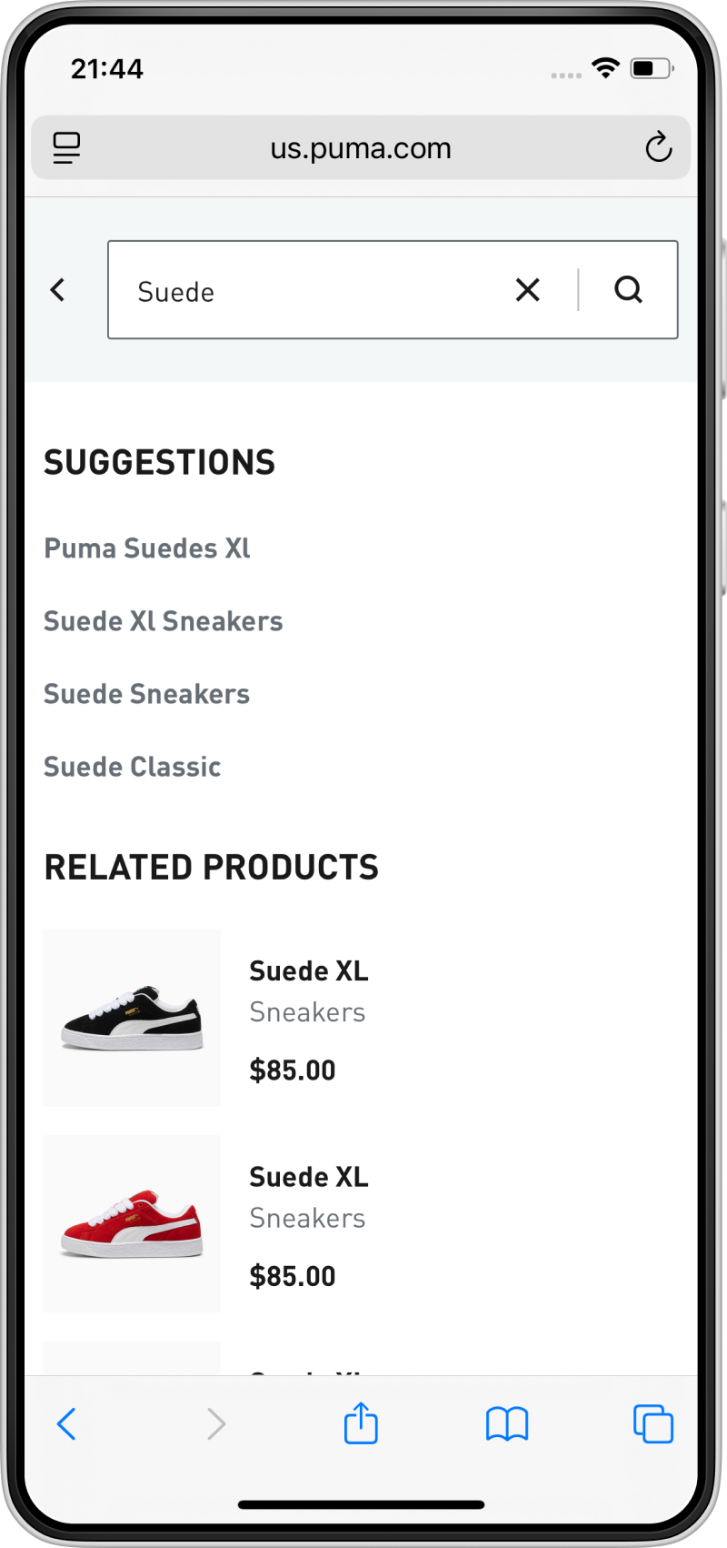
Search fly-out design
Hypothesis
Simplifying the search fly-out by removing extra elements will help users stay focused on the task. This will reduce cognitive load and encourage engagement with search results.
A/B Test results
A structured optimization program based on user research and A/B testing aiming to improve the customer experience and the business results of the website.
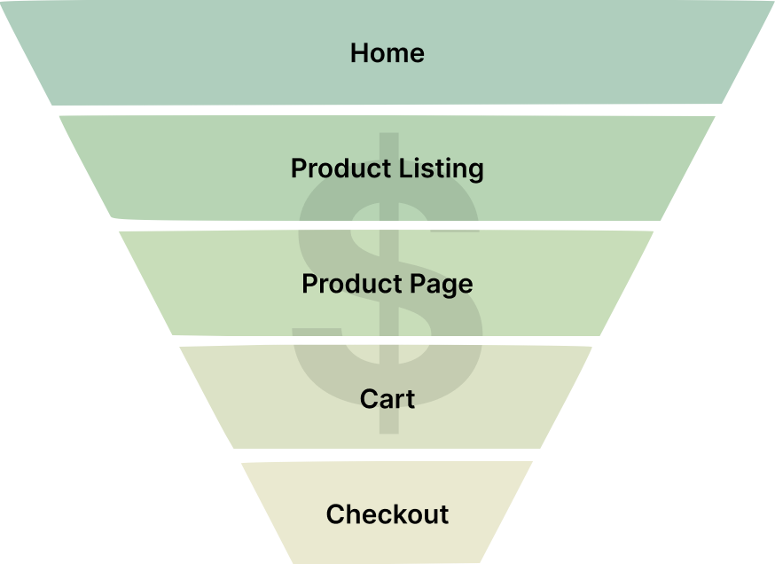
I conceptualized and implemented a conversion optimization program which broke the funnel into distinct customer goals and measured the signals that predicted progression at each stage. To align teams, prioritize the roadmap and ensure validated improvements moved into the product codebase, I connected strategy with execution.
Explore the caseSee more details below
The program broke the funnel into distinct customer goals and measured the signals that predicted progression at each stage. Page-level indicators guided decisions while transactions and revenue remained the commercial guardrails.
This decision framework was adapted to different customer needs and ranged from product search and discovery to post-purchase engagement.
Simplifying the search fly-out by removing extra elements will help users stay focused on the task. This will reduce cognitive load and encourage engagement with search results.
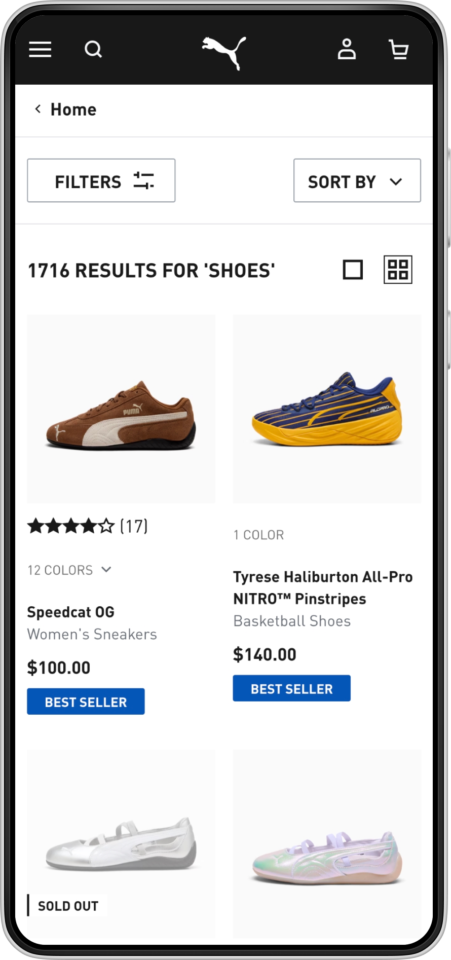
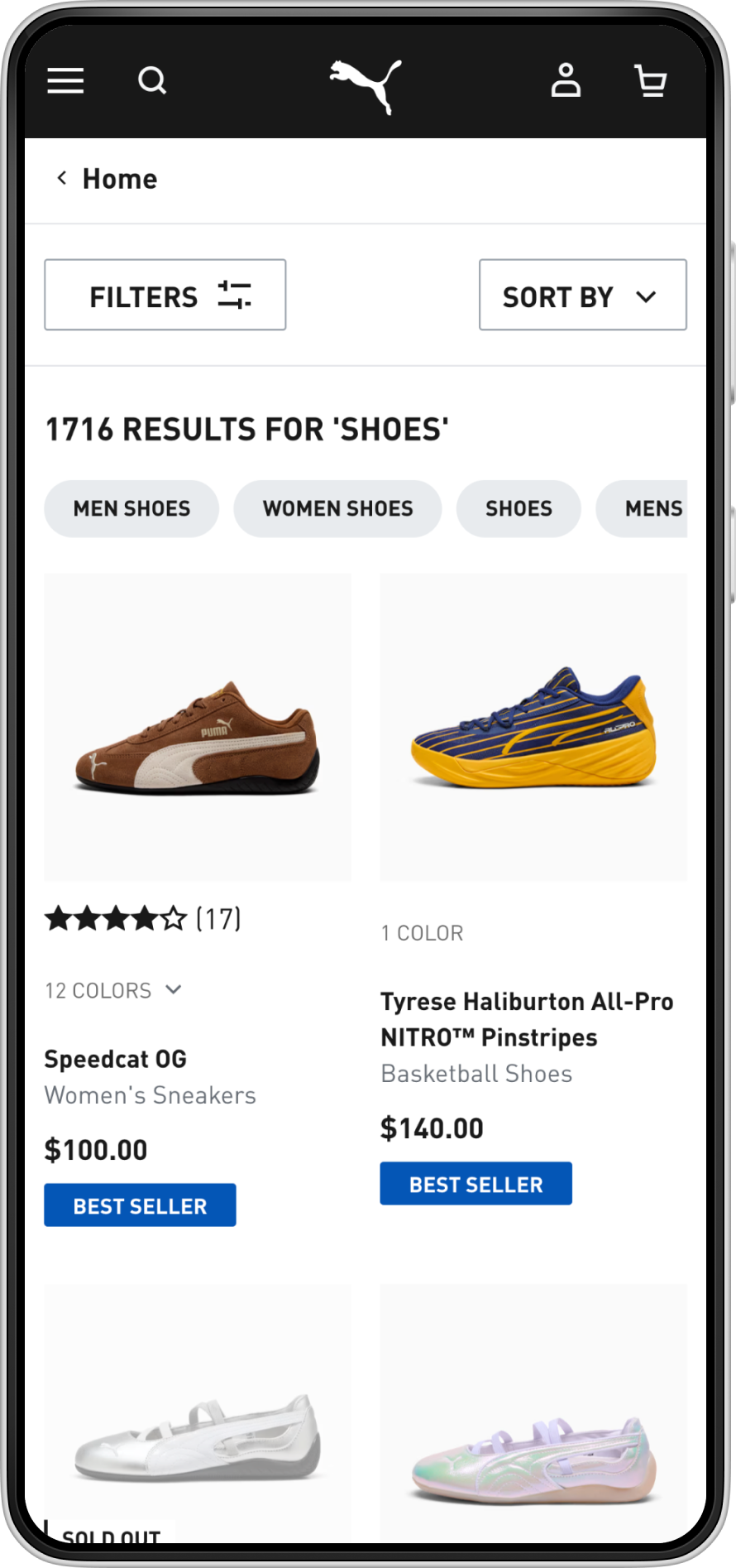
Related queries on the search results page will decrease search abandonment and will lift the conversion rate because they will help users quickly refine their search and explore relevant alternatives.
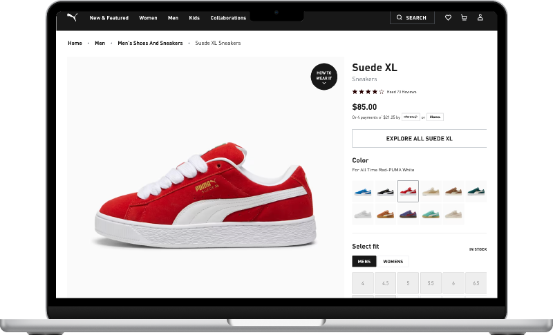
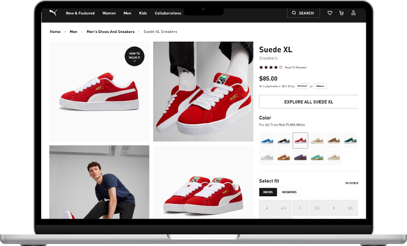
Showing products as an image grid above the fold when the PDP is viewed on desktop will reduce the bounce rate by helping users better evaluate the appearance of the products.
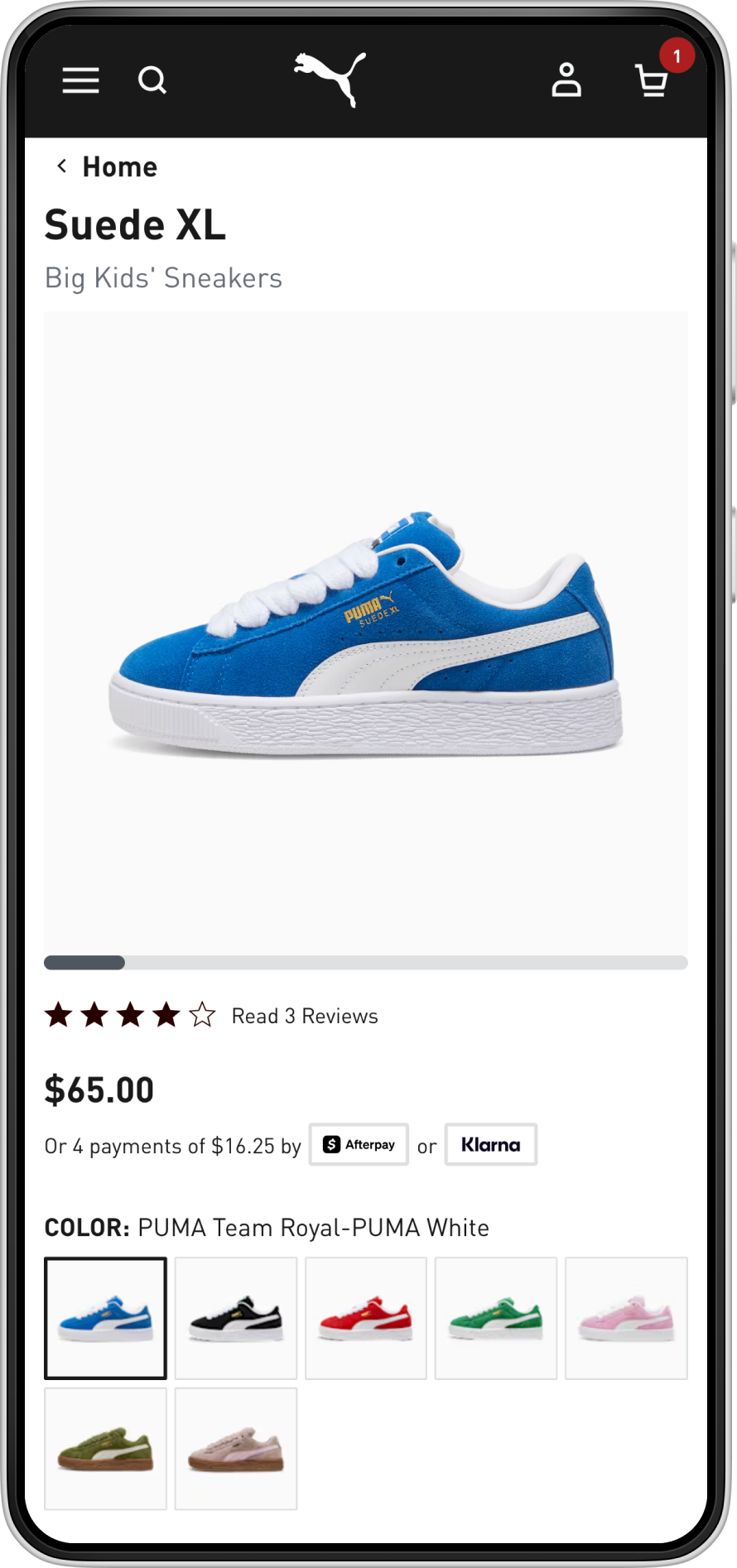
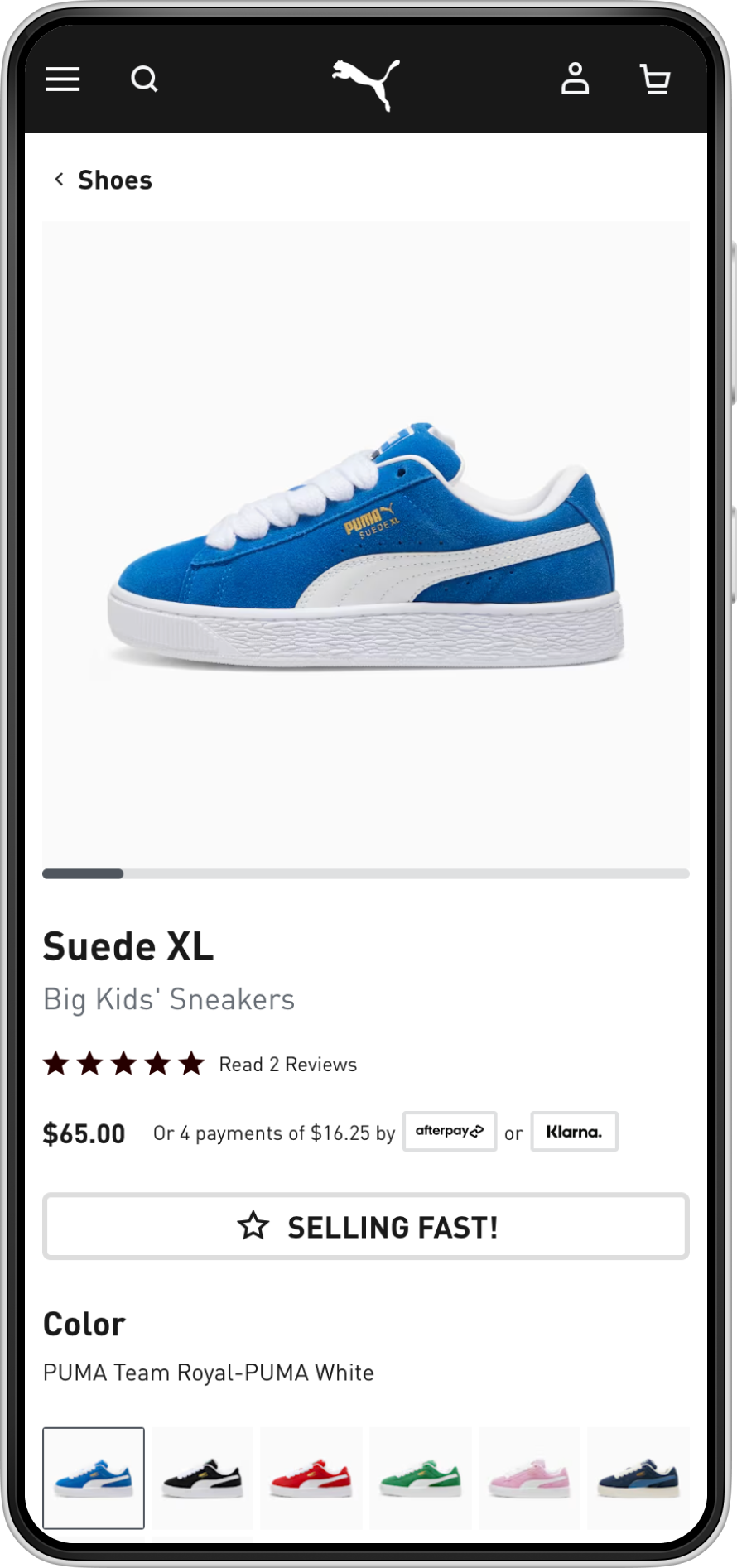
Showing nudge messages indicating that products are selling quickly (based on real-time stock data) will trigger the scarcity effect and increase the Add to Cart rate for the targeted user segment.
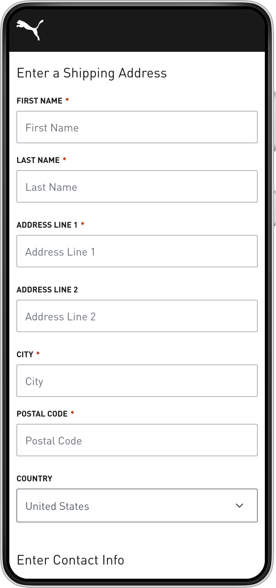
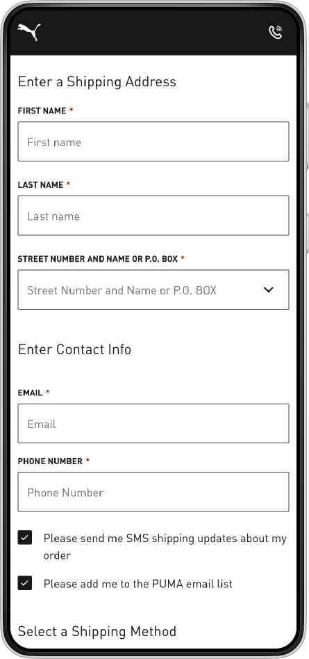
Showing only essential fields and revealing additional inputs when they are needed will reduce checkout drop-off by minimizing cognitive load and improving the perceived simplicity of the form.
User research indicated that registered customers found the existing account section difficult to navigate and lacking key functionality. Based on that feedback and business stakeholder interviews, we identified pain points and redesigned the experience to fix them.